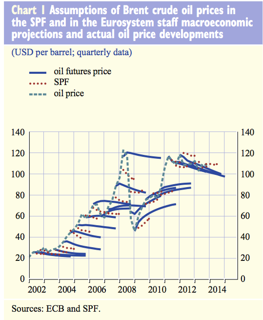
Why you shouldn’t trust oil price predictions in 1 chart
City forecasters are well paid for their advice – colleagues and clients rely on their predictions and make big bets and investment decisions on their word.
But this shocking chart from the European Central Bank shows how wrong the forecasters are, pretty much all the time.

The light dotted line shows the oil price which has risen and fallen pretty sharply over the years. After all, nobody would need to hire an expensive forecaster if the market was really easy to predict.
The dark blue lines show market predictions of where prices will go.
And the red dots show private forecasters expectations.
At pretty much every stage, the futures markets and forecasters predict prices will stay level.
Sure there are a few variants – when the market was booming they predicted a small fall, and when it crashed they forecast a small rise.
But pretty much constantly they were horribly wrong.
The only time the futures markets and forecasters have been right is when oil prices are flat.
A couple of years of stability have been great for forecasters, since they tend to predict a flat price.
But don’t see this as proof the analysts have suddenly worked out how to read the markets – they’ve just had a lucky break with prices staying flat.