UK and London house prices mapped: An average wage in Blackpool will buy you less than two square metres in Chelsea

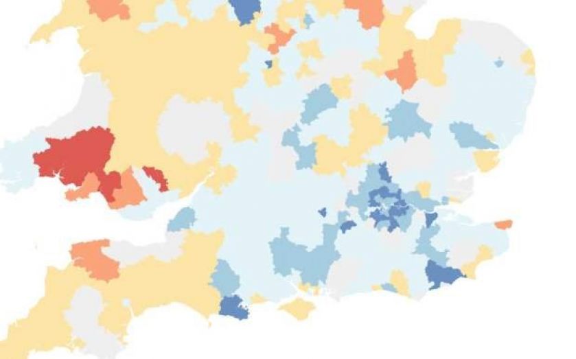
Click on the buttons in the top right to reveal the layers
The average wage in Blackpool will net you one and a half square metres of floor space in Chelsea, while a Westminster dweller could buy 42.6 metres of home in Blaenau Gwent, such is the disparity in the UK’s housing market.
Westminster is the borough where residents have the highest median salary and Blaenau Gwent, in Wales, has the cheapest price per square metre.
By comparing ONS data for median wages in different local authorities to Halifax’s research revealing the average price per square metre in the same areas, it become clear where money goes furthest: Wales and the north. The calculations are not based on mortgage payments – merely how much residential room the average person could buy if she dedicated her whole salary to the task.
The map above has three layers. The first shows how many metres of floorspace a resident in a given local authority can by with his or her median gross annual earnings. As we can see, London is a black hole for housing investment. Although median wage data isn’t available for Kensington and Chelsea, the area with the highest cost per square metre (£10,854), in Camden, Westminster, and Hammersmith and Fulham you’ll get barely over four metres.


Outside of the capital, money goes decidedly further. In Merthyr Tydfil, again in Wales, the median salary will get you 24 metres of floor space and in Blaenau Gwent, the local authority with the lowest per-metre-squared price, you could buy 23.


Clicking the second button reveals how many square metres you can buy across the country for the national median wage (£22,044 according to the ONS). National median earnings will get you very little in London: two metres in Chelsea and Kensington and 2.5 in Westminster.

London Boroughs hog the top of the list. Outside of the capital there is huge variation. In Elmbridge, Surrey, you can get only five metres for £22,044, but in Wales (again) it's far more.

Finally, the third map shows the differences between how many metres the median salary would have bought in 2009 and how many metres the median salary could get you today. Reds and yellows show an increase and blues a decrease. Please note that some local authority boundaries have changed since 2009, meaning an increase in grey, null areas.
All the recent data has pointed to a cooling in the housing market, but as house prices continue to rise above both inflation and wage growth, properties aren’t becoming any more affordable.
In fact, as this last map shows, there has been a huge jump in prices per square metre over the last five years.
Nassos Stylianou contributed to this map