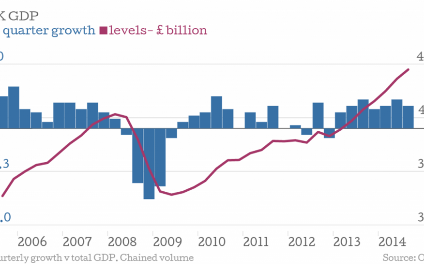
These charts sum up everything you need to know about the 2014 Autumn Statement

It’s Autumn Statement day and George Osborne’s speech will likely focus on the UK having a fast growing economy and falling unemployment rate.
Coming from the other side of the Commons will be assertions that there is a cost of living crisis and that expenditure is still too high.
What is the truth? Here are a few charts to clear things up.
Firstly, the UK’s GDP is growing impressively (above), with the latest ONS figures suggesting an annual rise of three per cent. Quarterly figures showed a rise of 0.7 per cent in the three months to September 2014.
The unemployment rate is low too: at six per cent it is only 0.2 percentage points higher than the rate in the US. However many of these jobs are towards the low end of the pay spectrum, meaning that government receipts are down even as expenditure rises.
This disparity, or the deficit, began before the Tories came to power, however.

Receipts are lower and wage growth is lower too. For the last five years, inflation has almost always been above wage growth, both for total and regular pay.

Government borrowing was down in the last financial year, but still has some way to go and the government will struggle to meet its target of eliminating the structural deficit by the end of the next parliament, should it get in.

Even if the deficit goes down (and eventually turns into a surplus) many will still claim that the UK's debt is a mountain that will take some shifting. It currently stands at around 87.8 per cent of GDP, or £1.5 trillion in gross terms.
However, UK government debt isn't really that high compared to historical levels. It was much higher following both world wars, but came back down again. This is partly because conscription means close to full employment, but that's another story.

In fact, it isn’t as high as the debt other European governments have. Italy, France and Ireland all have higher levels of debt.

So where does all the money go? Here is a bubble chart showing where UK government spending is apportioned. Notice the relatively large sizes of the budgets for the Department of Work and Pensions and the NHS. The chart uses planned figures for the 2014 – 2015 financial year.
