The first flat in Battersea Power Station is now complete – we take a look inside
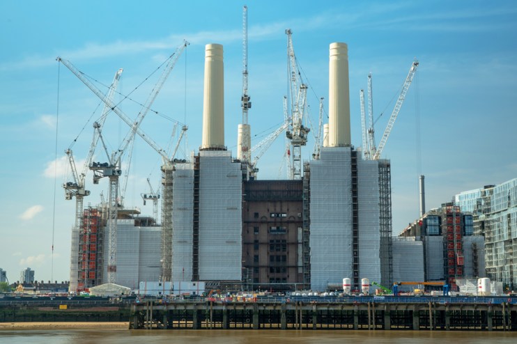
Plenty of property developers try to brand their latest apartment block as ‘iconic,’ which, nice as many of them are, is usually a bit of a stretch. The redevelopment of Battersea Power Station into 253 luxury flats and a new headquarters for Apple doesn’t have that problem, however.
Other than a three-year hiatus from 2015 while the damaged columns were replaced, its towers have been a stalwart of London’s skyline since the 1930s and have featured in everything from Hitchcock films to The Beatles’ Help! to a Pink Floyd album cover.
But when you redevelop such an iconic building, there is pressure to create something worthy of the structure it inhabits.
So what do the new flats look like?
City A.M took a tour of the first apartment to be completed within the original grade II*-listed power station with designer Tim Boyd of Michaelis Boyd – which also designed the interiors for Soho House and the Groucho Club – and Battersea Power Station’s UK sales director Georgia Siri.
‘Not cookie cutter apartments’
The apartment is situated on the second floor of the old Turbine Hall A, on the Western side of the power station. Boyd says there were 174 different floor plans for the 253 apartments, because there were so many parts of the building’s structure that could not be altered due to it being listed.
“The floor plans had to be tailored to the building – these are not a cookie cutter apartments,” he says. Most of the flats have long been sold, but when they came on the market in 2013 one-beds like this one started from £1m, while four-bed family homes started from £4m.
The apartments span eight floors and are accessed via wide corridors, some of them on mezzanines, with original brickwork and steel rivets along the walls. These walls will separate the apartments from the offices, shops and leisure space in the central part of the building, which they run around the outside of.
Features like the runner leading up to each apartment, the heavy wooden door and the long internal hallway within the flats signal a higher specification than many new builds and the apartment feels spacious for a one-bed.
The developers have always insisted that people have bought these flats to live in, not just as investments, and the care they have taken in fitting them out would seem to back that up. “It’s a place for people to live in rather than just exist in,” says Siri. “It is about owning a piece of heritage and history – the apartments have been bought by people who want to pass them down through their families.”
Inspired by the art deco ‘glory years’
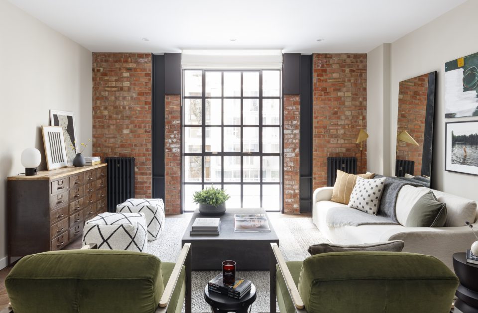
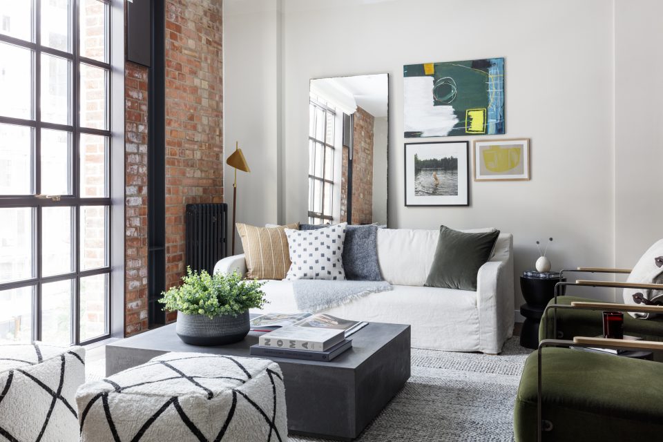
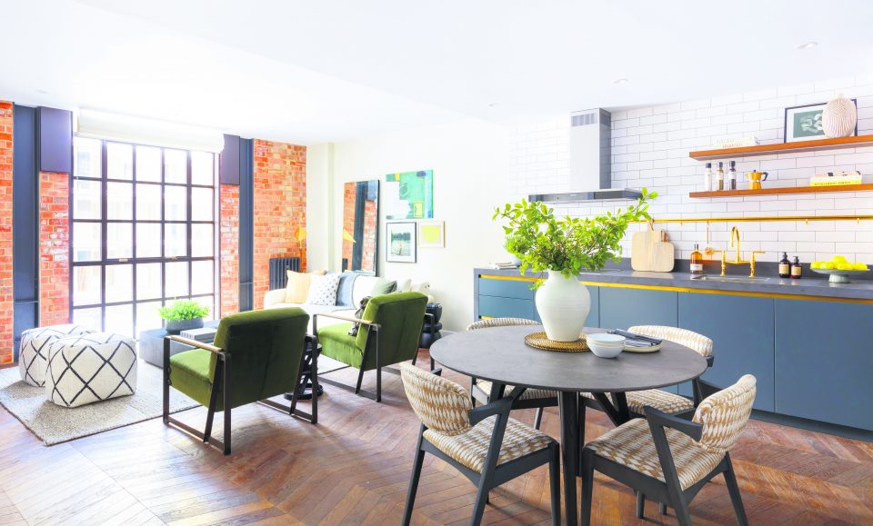
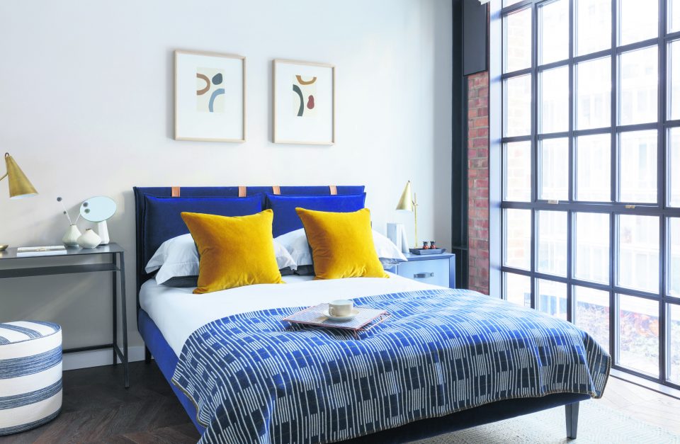
The original 1930s brickwork and steelwork are exposed, and the industrial theme is continued in the floor-to-ceiling crittal windows and cast-iron column radiators, which are painted black. The apartment was dressed by th2designs.
There are two colour palettes for buyers to choose from: Heritage 33 and Heritage 47. The power station was designed in two parts, and the palettes reflect those two eras. Heritage 33, on display in this apartment, uses bold materials and textures inspired by the power station’s art deco glory years when it produced more than a fifth of London’s electricity.
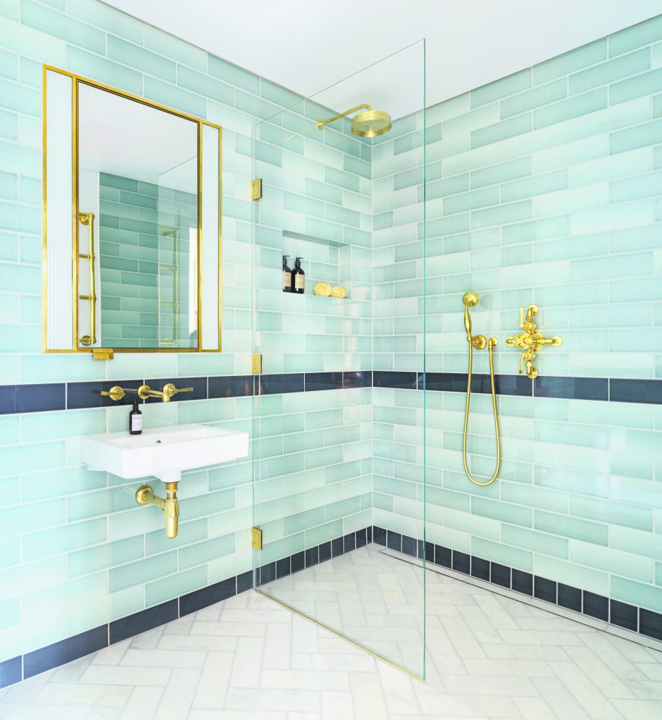
Boyd says this is referenced in everything from the toggle light switches to the bathroom which is fully tiled in teal and dark green with gold finishes. “Those colours were based on the colours of the original turbine hall,” he explains. “I like its relation to the rest of the building – it’s not like any other new development.”
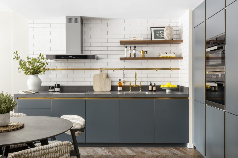
The finishes are designed to last, too. “The lacquered brass in the kitchen will improve with age, as will the chevron flooring,” says Boyd.
The power station may have an impressive history, but this apartment shows there’s plenty of life left in it yet.
