The top colours to paint your home in 2022

Every autumn household paint brands announce their “colour of the year”. The home improvement equivalent to groundhog day, it has become a much-awaited ritual, and the brands’ respective decision-making processes are rather opaque: some determine their colour through surveys, others via mysterious searches into the ether. But what this year’s colours bring is a sense of optimism.
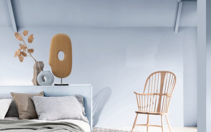
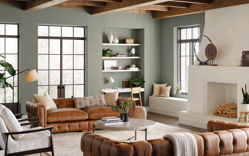
For 2022, the colours are pale. From Evergreen Fog by Sherwin Williams, a light breath of khaki, to Dulux’s Bright Skies, a crisp, snowy blue “reminiscent of the outdoors”, to PPG’s Olive Sprig, a “lush green with an organic green undertone”, and Breezeway by Behr, a kind of dusty, pond-water blue, the shades are delicate nods to the natural world.
And this makes sense: the past eighteen months have seen people spend more time than ever within the confines of their own homes, making the outdoors – open skies, lush fields, trees – all the more alluring. Add to that growing environmental concerns and an unpredictable climate, and you can see how the calming blues and meditative greens of nature wend their way into design palettes. Indeed, Dulux’s Bright Skies, explains creative director Marianne Shillingford, was inspired by “the shared experience of feeling trapped inside, and a growing concern for the future of our beautiful yet fragile planet”.
The lockdowns have also prompted homeowners to pay greater attention to the colour of their walls. Last year online sales of house paint soared during the DIY boom, with paint seen as a cost effective way to change a room’s temperament, particularly for renters. Indeed, paints can bring warmth to a space; the right shade can make a room feel bigger and airier than it is, and it can be as much about changing perspective as it is about acquiring a new aesthetic. Some even believe the right colour can enhance the value of one’s home, and make it easier to sell. Status and aspiration are bound up in paint choices – and a paint job is a way of leaving your mark.
How we choose to colour our homes can also have a considerable impact on one’s disposition. “Colour is affecting us every waking moment, whether we’re conscious of it or not” says Angela Wright, director of Colour Affects, a consultancy she founded in 1985 “to help individuals and organisations harness the profound psychological influence of colour on human response and behaviour”.
For Wright, the 2022 move towards greens and blues signals a new optimism. “Ever since the 2008 crash, greys have dominated the world”, she explains. “Grey is the colour of austerity and scarcity that dissuades rash expenditure. It captured the country’s mood: a lack of confidence”. Green, meanwhile, “is a positive colour, and denotes the presence of water – you’re not going to starve in a green world. Green and blue are optimistic and reassuring”.

While next year’s dominant shades are green and blue, there isn’t always a colour consensus. Farrow and Ball has hedged its bets somewhat, identifying five shades it expects will dominate the colour charts next year: Babouche, School House White, Breakfast Room Green, Stone Blue, and Incarnadine, which, along with a brief nod to cooler tones, includes rich ochre and crimson.
The colour forecasting process has become something of a sport, and paint enthusiasts enjoy fielding predictions. Pantone’s colour of the year regularly gets covered by the press, and can ignite debate on social media. The declaration is now an important facet of the paint business, and in the past 19 years of choosing its colour, Dulux has assembled “leaders in design, colour, fashion, and the built environment” to decode the right paint for the moment. They work to “define what we need” from a colour, and this year it was “a sweep of limitless sky” and a breath of “the open air”. Some colour companies even have elaborate “colour unveiling” parties.
With this attention comes competition: Dulux has started appointing Colour Ambassadors. Last year, the title holder was radio DJ and host Clara Amfo, for Brave Ground, an earthy shade of brown. “I love the colour of Brave Ground and what it symbolises,”she said. “It’s Mother Earth, our roots. It’s perfect for this year as it makes us feel more connected to where we live. It’s a calming, motherly colour to look after us all”. This year Behr enlisted the help of singer Katy Perry, in collaboration with Spotify, to “give design a new rhythm” with a “Music and colour experience”. An “all-new color selector tool” promises to “help people discover personalised paint color recommendations through their favorite songs on Spotify”. This certainly plays into the growing awareness of synesthesia.
Though the subject of colour in the home may be dismissed as trivial, and the “colour of the year” label as nothing more than a PR opportunity, there is importance in the hopeful act of forecasting in a time when everything is uncomfortably “unprecedented”. And as the groundhog’s movements determine what to expect for spring, the colour of the year teases a slow rise towards new optimism: a timid one, perhaps, but a fresh start still.