iPhone 14 Pro Max review: The notch is gone and other stories

When Apple went fullscreen with the iPhone X, doing away with all but the slimmest black frame around the display, it divided the world into two categories: regular people, and those who vehemently, violently hated “the notch”.
The notch, for those struggling to remember the furore it caused back in November 2017, is the little blacked out… well, notch at the top of your phone where the front-facing camera and Face ID and a bunch of other sensors lurk. Purists were outraged that the purity of the design had been compromised, and many, many millions of words were poured into the internet discussing it.
For five years the notch-haters had to furiously put up with iteration after iteration of the iPhone that maintained virtually the same design, even as rivals experimented with alternatives including the “hole punch”. Until now, that is.
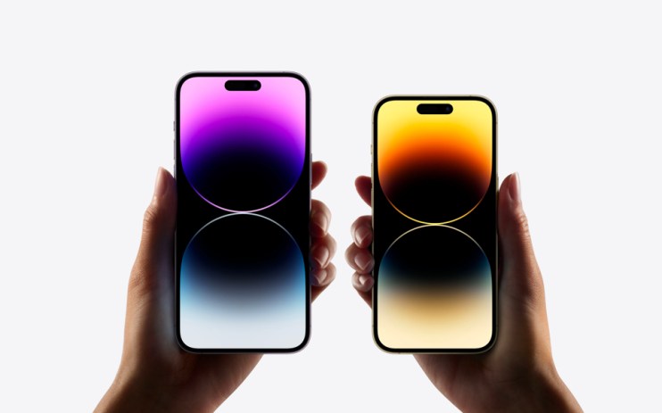
The notch is dead, long live the ‘dynamic island’. The first thing you’ll notice when you fire up the iPhone 14 Pro is the lozenge shape that floats free of the bezel at the top of the display. Crucially, it now reacts to the way you use the phone. Play music and the island will display a tiny image of the album sleeve and a little animated sound level. Plug the phone in and it’ll stretch across the phone to tell you that it’s charging and display the exact battery life. Go for a run and it will remind you that you’re using location tracking. Set a timer and the countdown is right there; no more burned dinners.
Tap the island and the phone will flick to the relevant app with a neat little animation. Tap and hold and you’ll get a pop-up with more information, such as the song title and the ability to skip, pause or replay the track. It can even juggle two apps at once, making it a genuinely useful way of quickly digesting information. If the notch was a bug, this is definitely a feature.
The other thing that jumps out at you about the iPhone 14 Pro is the always-on display, a feature borrowed from the Apple Watch. When locked the phone now displays a faint – but still easily readable – display with the date, time, some customisable widgets (weather, activity rings, any alarms you have set, etcetera, etcetera), as well as information on what you’re currently doing (more album sleeves if you’re playing music, for instance).
You’ll also see your notifications pop up here if you wish; again, this is genuinely useful. Neither of these features, however, are the thing that impresses me most about the 14 Pro – that would be the absolutely stunning display, which is incredibly bright and impossibly crisp. Where the last version maxed out at 1,200nits (the measurement of brightness), this reaches 1,600 as standard, rising to 2,000 when the phone detects direct sunlight. It really is beautiful.
Elsewhere, the camera is significantly improved, especially the lowlight performance. The main camera sensor jumps from 12MP to 48MP, while the telephoto and ultra-wide lenses see less dramatic improvements (we’ll be exploring the camera in more detail on cityam.com over the coming days).
The 14 Pro uses the new A16 Bionic processor, making it even faster than the already very fast iPhone 11, 12 and 13 Pro handsets. It’ll keep you futureproofed but don’t expect much of a noticeable difference. And the battery life? It’s not quite two day’s worth with moderate use, but it’s not a million miles away.
Now for the bad news. If you hadn’t heard (and if you desperately flicked through the rest of this newspaper without reading any of the actual news, for which I wouldn’t really blame you) the pound is having a bit of a wobble right now. Unfortunately that means this is the first iPhone that doesn’t just achieve pound-dollar parity, but actually costs more in pounds (£1,099 for the 128GB Pro, rising to a marriage-wrecking £1,749 for the 1TB Pro Max) than it does in dollars ($999/$1,599). It wasn’t too many years ago I was writing about smartphones surpassing the £1,000 mark for the first time and now we’re approaching double that.
It certainly cements this as an elite handset, especially at the upper end of the spec sheet, but then Apple has never really been a budget option. If you need the best phone on the market, this is it.
