Interiors: This on-trend shade could be the next millennial pink

When Dulux launched its colour of the year 2019 – spiced honey – a sense of weirdness descended. I have yet to see walls painted in this cloying bronzy-tan. Yet with the launches for colour of the year 2020 upon us (from the likes of Dulux, Farrow & Ball, Graham & Brown and Pantone) there already seems to be a front-runner emerging.
The British heritage brand Graham & Brown’s paint colour and wallpaper of the year is always eagerly awaited. The brand has a vast archive of wallpapers, and a creative team that lives and breathes pattern, artistry and colour. Each year it invents five new collections that reflect the zeitgeist, and from these it unveils its star wallpaper and paint combination.
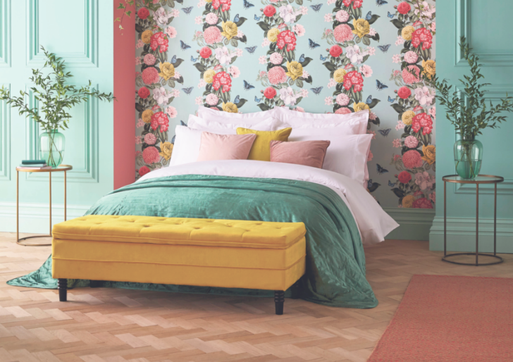
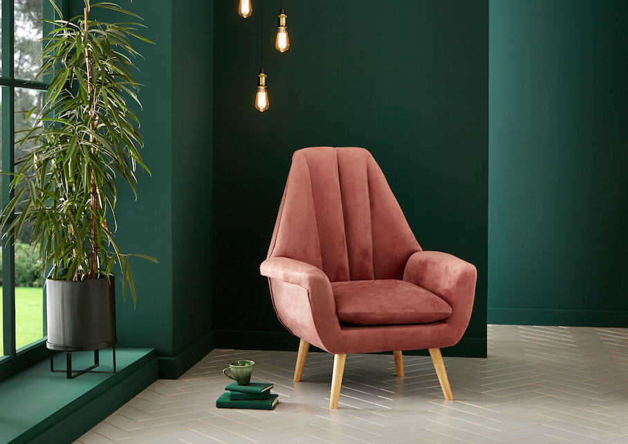
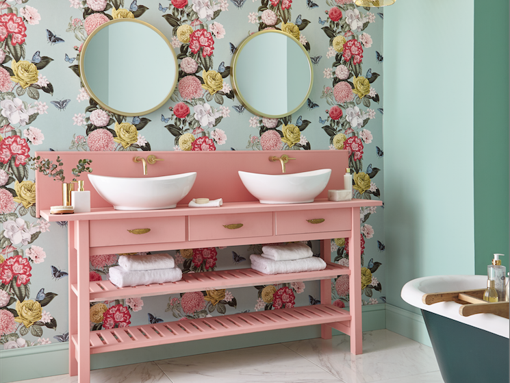
For 2020, the studio has merged an archival design and a contemporary colour palette to create the Bloomsbury Neo Mint floral wallpaper, as well as paint in Adeline, a deep, flat, matt bottle green. The combination is both uplifting and comforting.
“The enduring popularity of floral wallpaper designs shows no sign of waning,” says Paula Taylor, Graham & Brown’s colour and trends specialist. “As we continue to migrate towards busy urbanised spaces, it is becoming more and more important to bring the outside in and channel the healing properties of nature.”

Pink has been a huge colour story for a while now, and both neo mint and deep green make for perfect bedfellows, bringing to mind a vibrant English garden.
For the Bloomsbury set of four wallpaper colourways, the artist’s hand has woven together chrysanthemums, primulas and roses with foliage and insects in a vertical pattern known as a totem, which is adorning all the best-dressed walls right now.
‘Gender-neutral appeal’
Sixteen months ago the trend forecaster WGSN said that neo mint’s ascendency for the next decade would be down to its gender-neutral appeal, optimism, cleanness, purity, and being “a shade that succinctly aligns futuristic development with nature.”
And Dulux, playing it safe after last year’s head-scratcher, agrees that mint is in, having announced as this article went to press that its colour of the year for 2020 is a hazy pale green called Tranquil Dawn.

Over at Vesta Interior Design, they have been using neo mint in a variety of cleverly elegant ways: as upholstery for headboards and chairs, for bedlinens, as metro tiles and as painted woodwork. Vesta’s senior interior designer Gemma Roberts loves neo mint for being “oxygenating, calming, balancing and youthful, a cool green that’s a breath of fresh air”. She suggests using it on a feature wall, upcycling an old piece of furniture, or choosing neo mint tiles to create a fresh and calming kitchen or bathroom.”
It’s easy to use with base colours, too. “When teamed with neutrals, such as taupe and grey, neo mint adds a pop of colour without being too dominating,” Roberts says. “For a fresh look, pair with white, or with blue to echo colours of the sea. Teamed with deeper shades of forest green it evokes nature, and with dusty pink it provides a contrasting yet muted palette.”
Graham & Brown Bloomsbury wallpaper in Neo Mint (£60 per roll) and Adeline resistance ultra matt emulsion (£44 per 2.5 litres) grahambrown.com