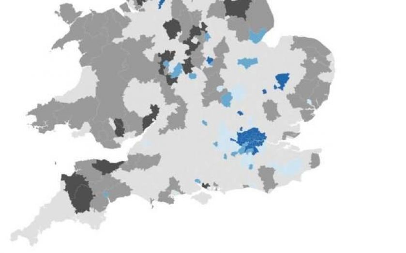
Interactive: Theresa May says the Conservatives may miss their immigration targets, but how high is UK immigration?

The home secretary Theresa May has all but admitted that the government will be unable to meet its target of limiting immigration to the tens of thousands in time for next year’s general election. What is more, David Cameron is expected to announce bans on benefits for UK migrants, despite the data showing immigrants are less likely to claim benifits than UK born residents.
The map above shows how many people per 100,000 live in each local authority in the UK. Click on any local authority to see the number of non-UK-born residents in each area. Grey areas are below the UK figure of 124.3, while blue areas are above. A second map, further down, shows how the numbers have changed since 2009 and the last year of Labour's time in power.
It is of course unlikely that we are going to reach the tens of thousands by the end of the parliament. Why is that? It is because we have seen increasing numbers of people coming from across Europe, partly because our economy is doing better than other economies across Europe.We have been doing what we can in relation to EU migration but there is more to be done.
Despite what May says, official data from the Office of National Statistics (ONS) shows that there has in fact been an uptick recently. This data will have cheered those who believe immigration has a positive effect on the economy.

Indeed there is a lot of data showing immigration is not only a good thing for the economy, but is also not high in important seats targeted by the anti-immigration party Ukip. As the map above makes clear, diversity is higher in cities than in the countryside and there is a huge difference between the areas with the lowest number of foreign born residents and the least. Here are the ten regions with the greatest number of non-UK born residents:

And they’re all in London. Here is what the list looks like if we remove London from the equation. Note the University towns of Oxford and Cambridge, where foreign students are likely to be affecting the data. Medway, the local authority for the Town of Rochester, has a rate of 81.7 per 1,000, far down the list and a long way below the figure for the whole UK of 124 per 1,000.

Now, to show the disparity, here are the areas with the lowest numbers:

A jump from 0 to 533 shows how immigration must be viewed vastly differently in different areas. But how have these numbers changed since the Tories came to power Here is a map showing how the number has changed since the last full year of Labour government, 2009:
Here is a chart showing the biggest movers. Notice Slough has cropped up again and Exeter, which has a reputable University, has seen a great change, perhaps again because of the student influence. Again, Medway (where Rochester can be found) is not on the list. In fact, it has 39 fewer non UK-born people per 1,000 than it did in 2009.
