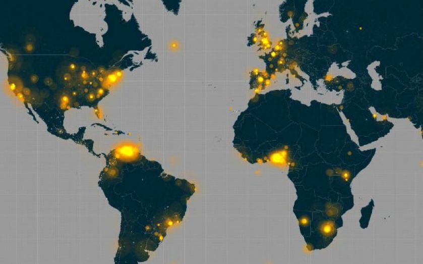
How Ebola spread: This Twitter visualisation maps mentions of the outbreak

A new map visualising Ebola shows how the first confirmed case in the US sparked a huge surge in Twitter chatter around the world, as fears over the spread of the outbreak increased.
The map tracks every mention of the Ebola hashtag (#ebola) across the world over the last month, with tweets coming from as far afield as the coasts of Antarctica and Alaska.
Mentions can be seen lighting up across the US and Europe from the 1 October onwards, when American officials confirmed its first diagnosis of Ebola in Texas.
Twitter mentions of Ebola can be seen in Liberia, Guinea, Sierra Leone, where the outbreak is concentrated and first began, causing more than 3,000 deaths,
Neighbouring countries in West Africa such as Senegal and Cameroon can also be seen talking about Ebola where the disease has not yet spread.
Most mentions in the area can be seen in Nigeria, where officials and doctors have managed to halt the spread of the disease, reflecting the country's greater access to technology as a more developed country.
Twitter mentions of the disease have little correspondence to how the diseases has spread on the ground and how it might spread in the future.
Liberia shows very few mentions compared to the rest of the world but has been hardest hit by the disease. It is the fourth poorest country in the world and prior to the outbreak had just 200 doctors.
Between April and June, when the disease first emerged, its government spent $12m managing the outbreak – more than its entire annual health budget.
Despite the huge number of mentions in Europe and the US, an epidemic in the region is highly unlikely.
A report earlier this week from scientists tracking the disease identified the more worrying development of Ebola would be contagion in other African countries, where it is less likely to be contained.