Hockney at Royal Academy: I hate these paintings in my bones

I have a theory. I think someone has done a Kathy Bates on David Hockney. They have kidnapped him, stuck him in a chair, handed him an iPad and told him – on pain of a sledgehammer to the knees – to paint. And paint he has, again and again and again. Tree after tree, field after field, clearly hating every minute of it. Because nobody could love these wretched iPad paintings. Nobody could look at them, then look at his work from the 1960s and 70s, and say “these are all nice, aren’t they?”
I hate these paintings. I hate them in my bones. I hate that the Royal Academy walls are plastered in them. I don’t know why this is happening.
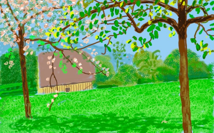
This is Hockney’s third series of landscape works, this time attempting to capture the essence of Spring in Normandy, although it mostly consists of swathes of migraine inducing lime green. The exhibition coincides with his “redesign” of the Piccadilly Line logo, echoing the masthead he designed for The Sun newspaper in 2017 (also made on his iPad, of course). Back then, he seemed to get away with it. This time he did not – a pleasant afternoon can be spent browsing the savage pastiches that appeared on social media.
The Tate Britain retrospective at least featured Hockney’s good paintings – A Bigger Splash, The Sunbather, Peter Getting Out of Nick’s Pool – alongside his iPad paintings, which took the edge off a bit. Here it is just lime green fields all the way down. Dozens of them – 116! – all functionally identical, all utterly hateful.
Hockney’s great works married a sensual, impish mischievousness with real art historical rigour. He grappled with the way three dimensions translate into two, how spectrums of colour condense into blocks, how lust and loss appear when rendered in acrylics. I don’t see any of this in his new work. To say they look like they were made in MS Paint feels horribly reductive but… they really do. There’s a barbarian clumsiness to the garish colours, the ungainly repeating dots. You might call them impressionistic but that would imply the presence of an impressionist.
It wouldn’t be so bad, perhaps, if digital painting were something new, something unexplored, with Hockney blazing a trail through this exciting new medium. But people have been making digital art for decades. I’m reminded of an interview with Ian McEwan, who had just written what was essentially a science fiction novel, in which he offhandedly dismissed the entire genre of science fiction: “There could be an opening of a mental space for novelists to explore this future… not in terms of travelling at 10 times the speed of light in anti-gravity boots, but in actually looking at the human dilemmas.” This is a brilliant novelist who appears unable to see beyond traditional literary fiction, who cannot conceive of a lowly science fiction writer using the genre to explore “human dilemmas”.
Hockney must have gone through something similar with digital art, unable to conceive of someone outside of the art historical establishment doing paintings… but digital! So he’s regressed to 1994, bashing out rudimentary works in a sad vacuum.
There are many reasons an ageing artist might change the medium in which they work. When Matisse was forced to lay down his brush in 1941 after a cancer operation, he discovered cut outs and embarked on one of the most fruitful and creative periods of his life. Hockney’s iPad paintings, on the other hand, show not only a paucity of craftsmanship, but of imagination. They are dull and glib and I hate them.
