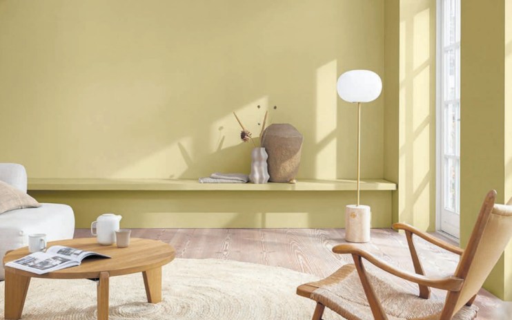
Colour of the year: ‘It looks like magnolia with a hangover’

There is something wonderfully absurd about the annual colour of the year awards, which attempt to dress up selling paint as a sort of sociological barometer. What shade captures the public mood right now?
What hue best describes the world today? According to Dulux, that would be Wild Wonder. The paint-maker describes it as a “positive, glowing tone, inspired by the natural world.” To me it looks like a kind of dark beige – cream with a bit of grey and a hint of green thrown into the mix.
Think magnolia with a hangover. So what does Wild Wonder say about these strange times? A desire to return to nature seems like the most obvious explanation, with the yellowish, shade vaguely redolent of bales of hay and summer evenings.
It’s slightly less clear-cut than Dulux’s previous colour of the year, Bright Skies, which seemed like a rather literal response to the pandemic and climate change and a general desire for a healthy environment.
Dulux has form for erring towards natural hues, with its 2021 choice being Brave Ground – a terracotta-meets-soil sort of deal that would actually look very nice in my living room, had I not opted for a fetching teal called “proud peacock”. Pantone, on the other hand, is not constrained by the necessity for its colour of the year to match your sofa. The current shade du jour is Very Peri, “A new Pantone colour whose courageous presence encourages personal inventiveness and creativity.” Or, to you and I, purple.
What does purple have to do with ecological collapse, the tentative emergence from a pandemic, or impending recession? Grasping ever so slightly, I would hazard it was simply bright and cheerful, an escape from, rather than a reflection of, the modern world. Fashion houses have done something similar, with catwalks this year full of bold block colours.
Or perhaps it’s just entirely random, an annual joke, its selection no more valid than the football predictions of Paul the Octopus (RIP). This theory seems more plausible when you consider last year Pantone was unable to come to a decision, jointly naming “Illuminating” and “Ultimate Grey” as colour of the year. Get off the fence, Pantone. And Ultimate Grey, if you were wondering, is just… grey.
If that sounds bonkers, in 2017 the colour of the year was Ultra Violet, which if my GCSE physics serves me correctly, isn’t even visible to the human eye. Not the colour we needed, perhaps, but probably the colour we all deserved.
