Bank of England gives website and logo face-lift in ‘inclusion’ drive

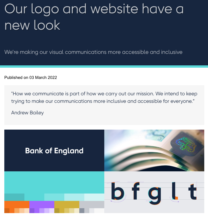
The Bank of England has given its website and logo a fresh lick of paint, it announced today.
A new typeface on the central bank’s website is designed to make it easier for people with dyslexia to read.
The Bank has also tweaked its logo to be more “inclusive”.

“The Bank of England has been around for hundreds of years, but it embraces advances in digital technology,” Governor Andrew Bailey said.
“How we communicate is part of how we carry out our mission. We intend to keep trying to make our communications more inclusive and accessible for everyone,” he added.
The Bank has been accused of failing to deliver on promises to boost diversity and inclusion within the organisation.
In July last year, a report on the Bank’s diversity credentials found despite efforts to improve representation of BAME employees, “there were still material disparities between the collective lived experiences, career opportunities and outcomes of minority ethnic and White colleagues”.
The website and logo facelift draw criticism from analysts, however.