| Updated:
Architects of the future: How young designers are taking on space constraints, the cost of living and technology
As property prices continue to rise and land available for development dwindles, architects and designers are tasked with devising ways to recommission and re-purpose spaces to make them suitable for modern life. Five architects and designers under 40 explain how they are taking inspiration from these challenges, and how they see their industry changing in the future.
TOM SURMAN
CO-FOUNDER, SURMAN WESTON
London is leading the way in the field of design and people are really starting to take notice of young designers doing things a bit differently. I think it’s partly down to companies like Apple bringing design into the public eye. In terms of architectural design, the current climate is more pluralistic than ever; it’s no longer the case that contemporary developments have to mean concrete and glass.
Space is always at a premium and lots of our work is on very tight sites, so we’ve become accustomed to challenging spatial situations. Rather than see this as a hindrance, we use the constraints as a design-driver, creating spaces that are unique to the site.
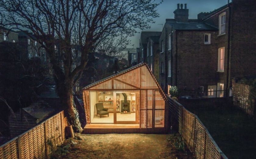
Our output isn’t confined to a particular aesthetic or style. Having worked on lots of projects with tight budgets we’ve learned to employ inexpensive materials in a manner that elevates them to levels of unexpected beauty, such as cutting up standard council-issue concrete paving stones to create the hearth in the Writer’s Shed.
We like to use pioneering products and techniques, but that doesn’t necessarily mean using hi-tech or faddy materials – it can also be about using something old in a new way. One of our latest projects uses cork as cladding and insulation, which is great because it makes the construction process very simple and it’s also very sustainable.
The Writer’s Shed project [which we completed under Weston Surman & Deane] is a kind of fairy-tale hut at the bottom of the garden where the writer and illustrator client can go to immerse himself in his work, is probably our proudest moment to date. Having designed and built it, we were thrilled that it was shortlisted for numerous architectural awards and was winner of the 2014 Hackney Design Awards. Many of our subsequent commissions have come as a result of the media coverage the project attracted.
LIZ BETTERTON
ARCHITECT, DAVID KOHN ARCHITECTS
Most people nowadays have some interest in architecture and design, and are better informed than ever. I like to think the appetite for “look at me” architecture is finally subsiding and buildings are being valued for their ability to make working, living places, not just “spaces”.
People are becoming engaged with materiality again. They want to experience different textures and vivid colours, which many architects in the recent past have been reluctant to use; more colour, more fun.
Technology has also changed the way we work. The increasing use of 3D modelling allows more comprehensive and early co-ordination but also allows the design team to make quicker decisions. Prosaically, changes to drawings require less manpower so the production phase can be less onerous.
We’ve been very lucky to have been able to put our vision into practice with a wide variety of clients: institutions like the Royal Academy of Arts, developers, public bodies including the Greater London Assembly, local authorities, art galleries and private homeowners.
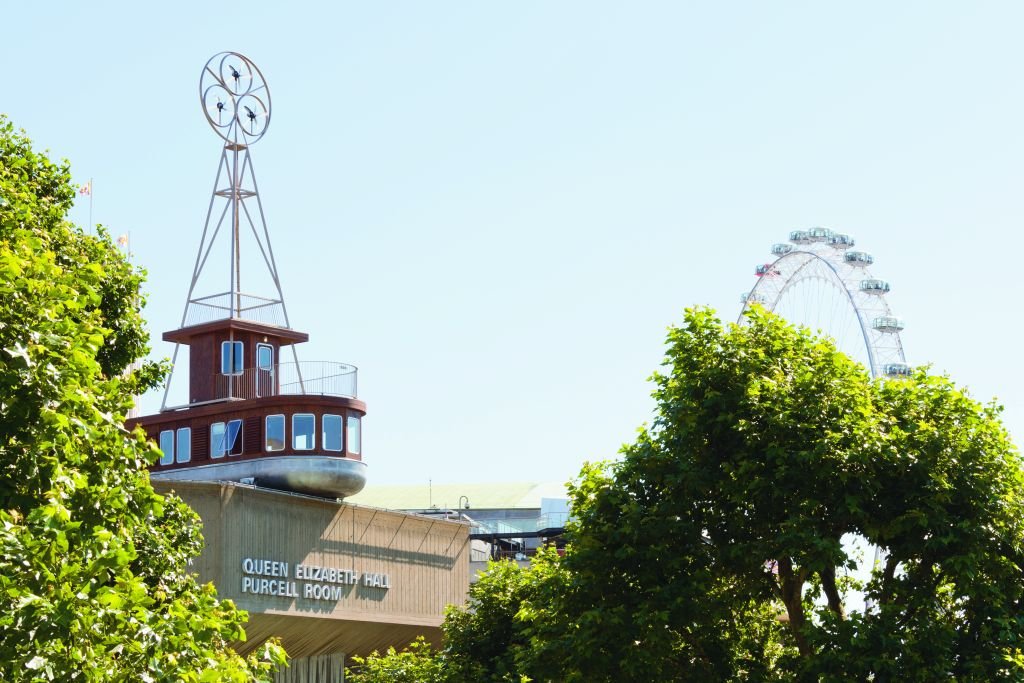
A personal highlight is A Room For London, the boatlike one-room hotel installed atop the Queen Elizabeth Hall in 2012. It’s very prominent and doesn’t try to blend in. It adds a joyous intrigue to the skyline as well as being a box of tricks inside. I love walking across the Waterloo Bridge, seeing it poke its bow over the Southbank below, knowing what it’s like to sit in the azure tower, watching the world go by.
TATIANA VON PREUSSEN
CO-FOUNDER, vPPR ARCHITECTS
Britain has a reputation for being conservative in her architectural tastes, but this has radically changed over the past 20 years. The new financial classes, who commission a lot of our architectural projects, tend to be better-travelled than in previous generations; they’ve often lived in Hong Kong, Dubai, Singapore, New York, Sydney – they’ve become used to a very different kind of architecture than your average Victorian terraced house.
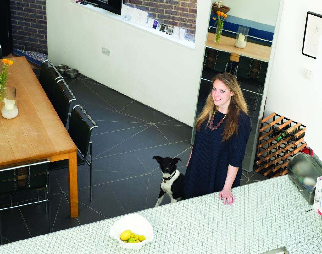
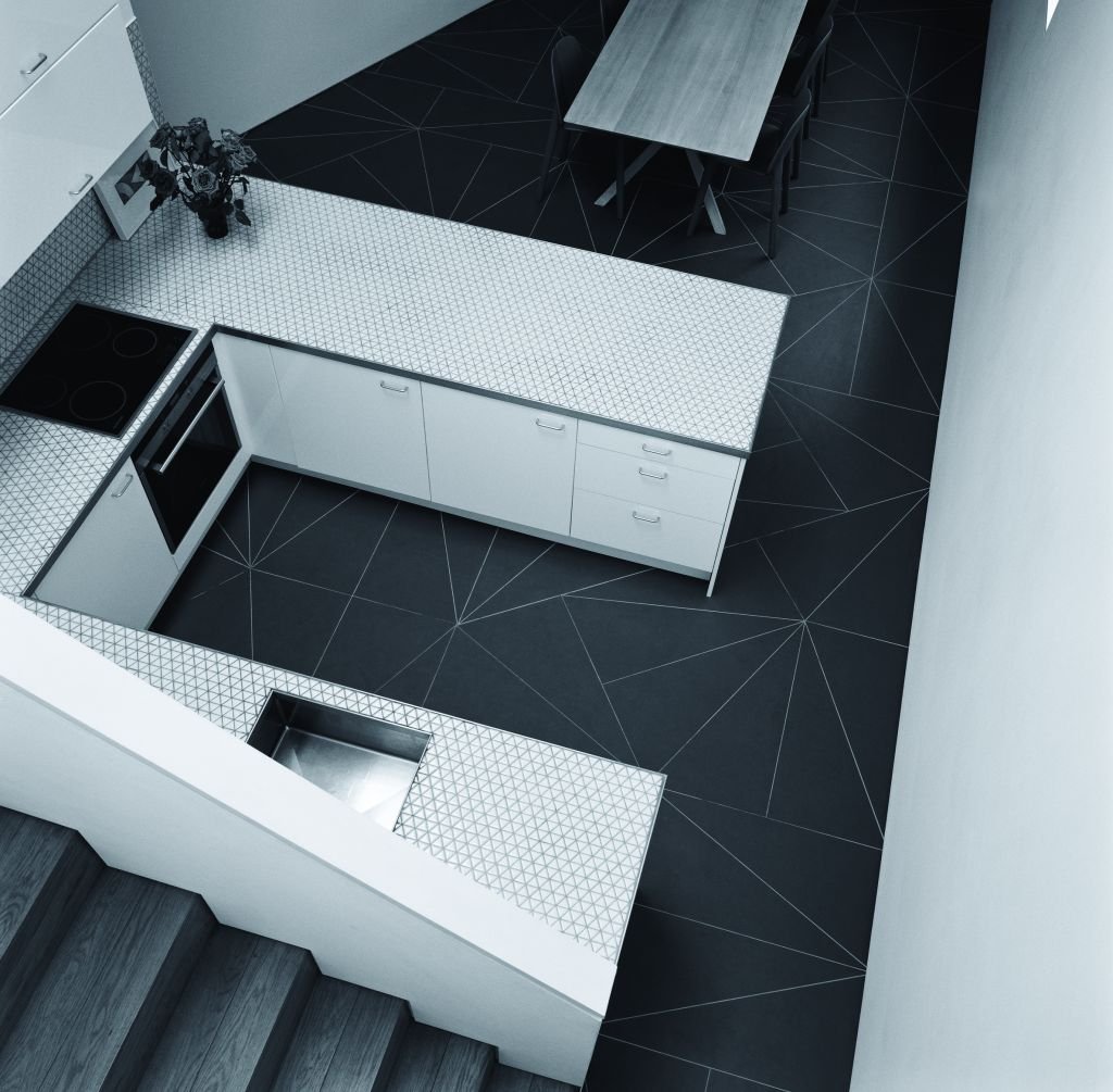
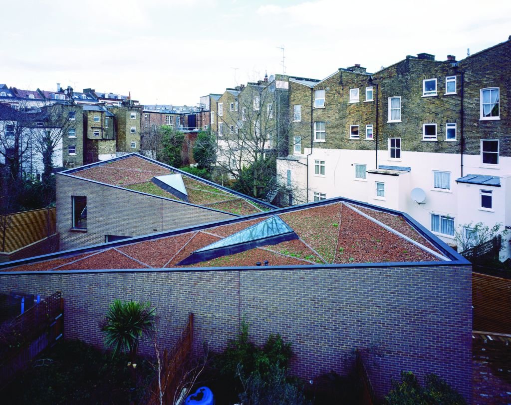
Most architects working in London today have to deal with extreme space constraints. I find this can work in the architect’s favour, making you think about how buildings are inhabited and what kind of geometries can bring order to leftover space. For instance, our Otts Yard project, which was shortlisted last year for the RIBA Stephen Lawrence Award, was a very unusual triangular site, which we used as inspiration for the fractal pattern that makes the development so distinctive.
We made each house triangular, as well as the courtyards and gardens, even the roof lights and tiles. We do a lot of these “infill” sites between existing buildings that often don’t have a street frontage, so the roof becomes the primary façade. The upper floors of the houses around look down these developments so we design roofs that are works of art, something that contributes to the neighbours’ view rather than detracts from it. We also try to create internal vistas and courtyards that prevent the spaces from feeling claustrophobic; gardens and courtyards are treated as exterior rooms, a continuation of the interior of the house.
Building Information Modelling (BIM) – which in volves sharing a 3D computer model between consultants, clients and contractors – can be a big help. It allows the possibility of daring and sculptural architectural forms and enables a much better quality of finish.
WILLIAM SAMUELS
CO-FOUNDER, WILBEN
Wilben, which I started with my twin brother Benjamin, specialises in buying and re-developing residential properties. As with many creative industries there’s a real cross-pollination of trends and influences at the moment and people are becoming braver about mixing things up – the traditional and the contemporary, one culture with another. For us this means mixing and matching furniture and fabrics from different origins and eras, layering different textures.
One of the most important considerations in our line of work is making the best use of space. On smaller properties we tend to adopt open plan living. By connecting two spaces – perhaps with folding or sliding walls – you have the option to separate them or to create one large room. We aim for a sense of flow in our developments, engineering the best use of walls, doors, room positioning and space. With confined spaces, we have to think very carefully about the size of every piece of furniture and joinery. Mirrors can be priceless when you need to give the impression of depth.
We design a lot of our developments in a fairly traditional style but with a contemporary twist, using cornices, high skirtings, wide architraves, dado rails and hanging rails, but in fresh, interesting ways. More than ever people are telling us that they want to see something new and unique.
LEWIS TAYLOR
DESIGN DIRECTOR, DAVID COLLINS STUDIO
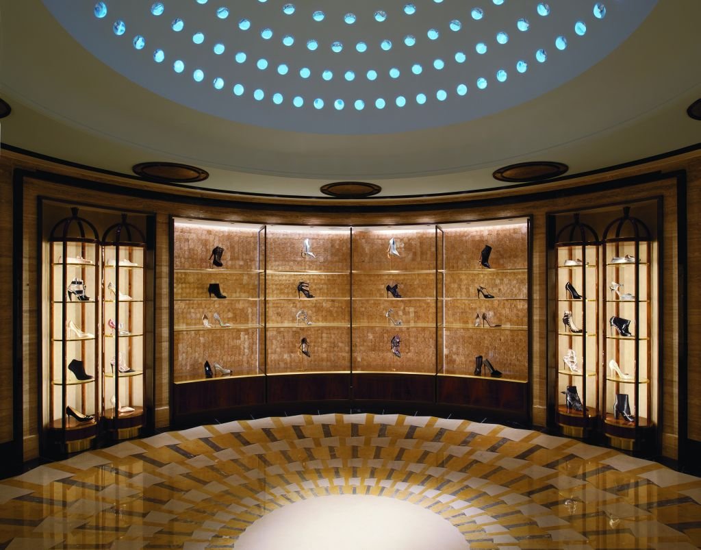
Our studio has worked across the residential, retail and hospitality sectors on projects including the 42,000sqft Harrods Shoe Heaven and the Jimmy Choo Town House on Bond Street.
We find retail design works at a faster pace than, say, private homes or hospitality projects. Within these spaces, we’ve noticed a trend for designs with a “brutalist” edge, using concrete, stone or marble – materials with a hard edge, but used in a very luxurious way. Even in a very soft, feminine environment like the Jimmy Choo store, the grey polished plaster finish has this brutalist element.
Retail spaces are a chance to create a place where customers can be immersed in a brand. The aim is to evoke an emotional response from those who interact with the space. It needs to be a well-considered identity that’s relevant to its client base. The launch of the Apple Watch and how Apple will go about marketing it has sparked a discussion about changes to the way people spend money and we’ll be very interested in how this impacts on the way we design retail spaces.
PEREEN D’AVOINE
DIRECTOR, RUSSIAN FOR FISH
Financial, environmental and space constraints mean there are lots of intriguing opportunities for architects right now. We’re seeing a new vision of what makes a home – people want to live in our increasingly crowded cities, which is leading to a re-interpretation of buildings that weren’t originally designed to house people.
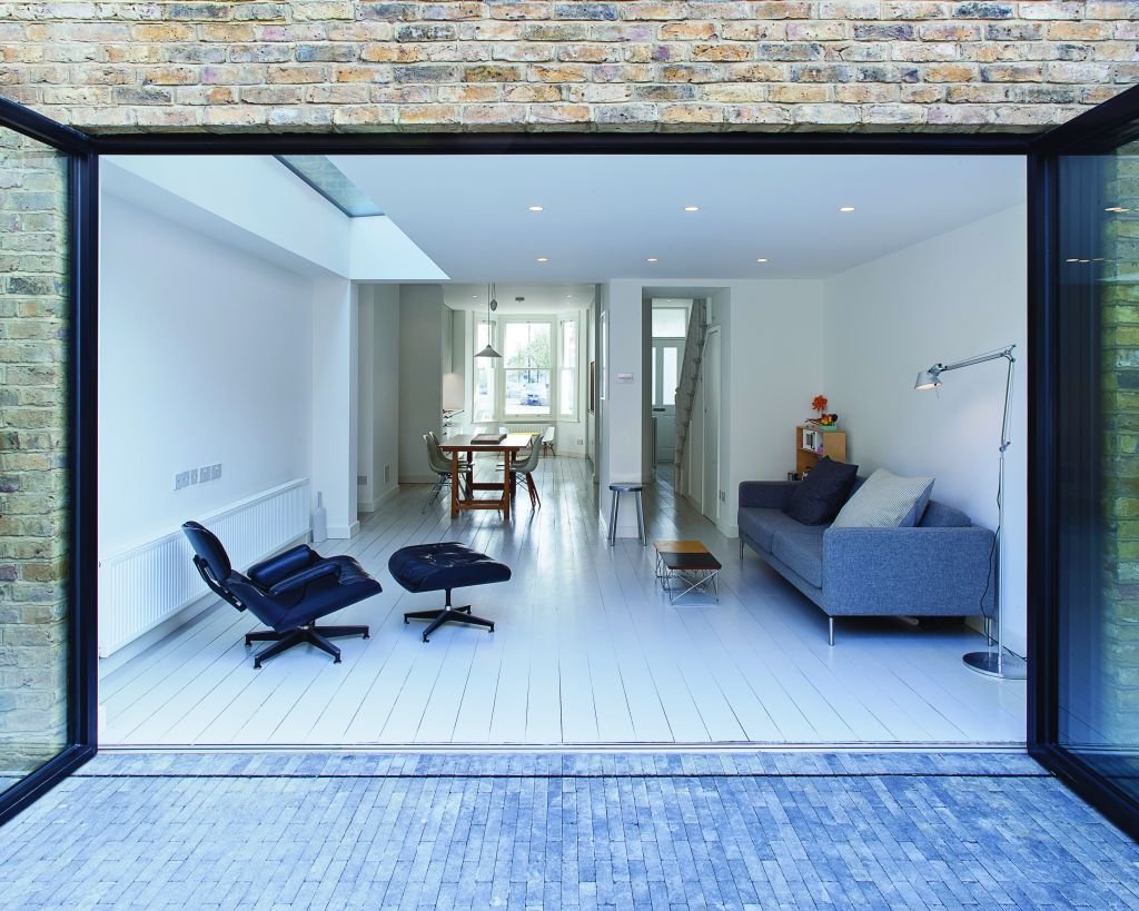
There’s been a return to traditional, locally-sourced materials; the humble brick is making a comeback over the once-ubiquitous glass and steel. We feel that contemporary architecture is about embracing simplicity and providing adaptable spaces. Rising house prices, rental costs and a lack of available housing are preventing a lot of young people from setting up their own homes, which has resulted in a return of generations living together; this provides us with some fantastic challenges adapting spaces to encompass these new requirements.
We’re often tasked with re-modelling existing spaces to make them suitable for modern living, but without increasing their footprint. We try to minimise the number of materials we use in each project and re-use existing materials found on site where possible.