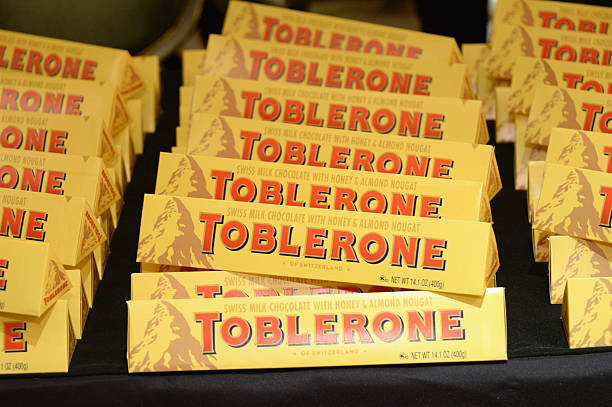
Toblerone doesn’t need the Matterhorn to scale the heights of chocolatier success

Toblerone is having to renounce to the iconic Mattherhorn on its branding. But people will still love it, because it’s not the mountain making it special: it’s the chocolate, writes Jim Prior
In the early twentieth century, the German sociologist Max Weber described three kinds of power in society. There is traditional power, passed through generations, such as a monarchy; bureaucratic power based on adherence to rules, such as the law, and charismatic power which pertains to the ability to influence based on the full merits of the source itself. John F Kennedy, for example, exhibited charismatic power. As does Elon Musk, whether you love him or loathe him. A truly great leader may benefit from all three.
The business of design is almost exclusively about the deployment of charismatic power. And so we meet the latest saga between Toblerone and the Matterhorn. The image has been an icon for the chocolate label since 1908, but Toblerone will now no longer be able to use the image because much of its manufacturing has left Switzerland.
It’s a familiar position for many: Champagne must be from Champagne, Parma ham from Parma, and Cornish pasties never from Devon. It’s not necessarily unfair, either. To continue to use the image suggests some affiliation with Switzerland. But under Switzerland’s “Swissness” laws, 80 per cent of raw materials for food must be sourced from the country to use the label, or 100 per cent for milk or dairy products. Toblerone, owned by US-multinational Mondelez since 2012, will now boast of being “established in Switzerland” instead of “from Switzerland”.
Toblerone does have a distinct design, which has separated it from its chocolate competitors. But the power of it doesn’t rest in the idiosyncrasies of the mountain on the package and the new plans for a generic mountain are unlikely to dent its influence. It has always deployed charismatic power as a marketing tool, and now must accept the co-existence of traditional and bureaucratic power.
Toblerone has weathered several storms. After Mondelez reduced the size of the peaks of its cocoa pyramids, sales continued to climb. So in commercial terms, the Matterhorn isn’t a make or break. The charismatic power of the Toblerone brand identity is not the topography of the mountain. It’s the colour and summit-conquering confidence of the typography contrasted against the pack. It’s the shape of the chocolate and the box. And it’s the cleverly concealed face of the bear hidden in the mountain side that is always there, whether you acknowledge that you’ve seen it or not. These features are where the charisma lies. A rational comparison of the mountain on the box to a real-world mountain that few people would even recognise, really doesn’t matter a jot.
In fact, its exclusion from the “Swissness” rules may even be liberating: freed from a graphic tradition – ironically by bureaucracy – perhaps Toblerone can extend its line of sight toward even more ambitious ideas. So long as Mondelez keep their focus on charismatic design, the commercial future of Toblerone will be just fine.
In all honesty, it has been a storm in a teacup in the truest sense of the phrase. It’s true, Swiss products can command a higher price. But Toblerone has the benefit of legacy, even though it is being forced to give up a bureaucratic label.
The responsibility of design in a case of change is not just to adjust, but to add power and value. I don’t worry about Toblerone’s mountain not being the Matterhorn, so long as their new design landscape has the Weberian charisma this iconic brand deserves.