To understand what London needs, we should look at the history of spatial poverty

In the “Republic”, Plato wrote that “any city, however small, is in fact divided into two, one the city of the poor, the other of the rich”. This still rings painfully true today, especially if the city in question is London. The capital is a uniquely unequal place: it hosts some incredibly wealthy people, as well as a huge number of deprived households. With a cost of living crisis, the number of families in poverty is set to rise. Often, the rich are living cheek by jowl with the poor.
The first person to make spatial considerations about poverty in the capital was Charles Booth, considered by some to be the first true social reformer of our times. At the end of the nineteenth century, Booth set out on a mission to map the whole of London based on class. He wanted to understand the real causes of poverty, in an era where deprivation was still considered a sin of the morally corrupt, rather than a condition caused by lack of opportunity.
His maps can be easily accessed online today – and have withstood the test of time. South Kensington, today still a deeply divided borough, is a blend of red (“middle class, well-to-do”) and blue (“very poor, casual, chronic want”) with an occasional spray of black (“lowest class, vicious, semi-criminal”). The language is very different from what we’d use today, but the content is very relevant.
In Booth’s time, 33 per cent of Londoners were living in poverty. Today the number is 27 per cent, according to pre-pandemic data by Trust for London. The percentage is still insanely high. New maps show these pockets of poverty. The one provided by the Consumer Data Research Centre has used the index of multiple deprivation as its metric, colouring neighbourhoods from the most deprived decile (red) to the least deprived (blue). Pretty much anywhere surrounding Richmond Park is in shades of blue, while if we look at Tower Hamlets or Newham, the best you can get is a rare shade of yellow (5th deprived decile) – most of it is red.
Thinking about poverty in terms of space has very important implications for policy-making. Poverty is strongly linked to where people live. Highly deprived areas are often far from employment opportunities, have poor transport and lower wages. This means higher levels of market exclusion, and more poverty. It’s a vicious catch-22 that often gets downplayed.
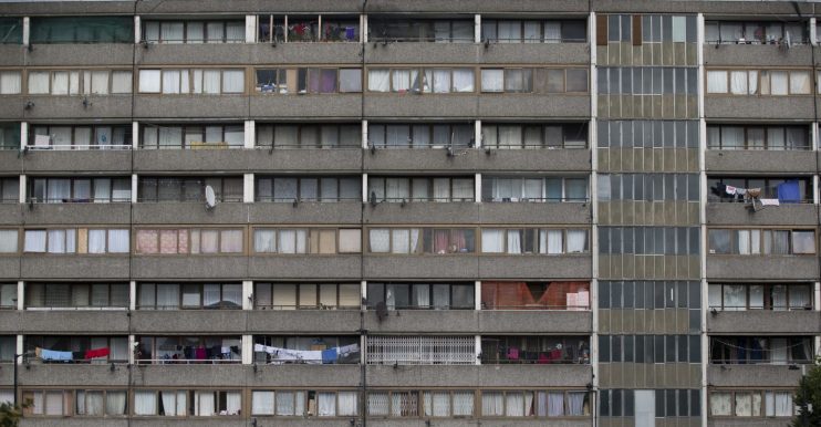
At the time, Booth spotted how rich and poor were living side by side, but poor streets were usually in very localised clusters. This means that impoverished communities were living in a wealthy area, but excluded from it. Council estates were built as mini-fortresses – something often true today. Unlike other big European cities, London has never relegated its poor to the outskirts. Some of the most in vogue neighbourhoods, like Islington, have a very high number of council estates. This is good policy, as it avoids ghettoisation. But it doesn’t change much if poorer households are still cut off from the rest of the area.
Yet, it’s not like one is not affected by the other. When house prices boom in an up-and-coming area, poorer neighbouring streets are affected and their residents risk being priced out. Regeneration projects – which on paper are a good thing – carry the same risks. So we have pockets of poverty and wealthy streets side by side, but the former are often physically divided from the latter by side streets or railways. “Sometimes specific bits of planning and infrastructure can totally separate neighbourhoods. Within London, we’re talking about very extreme inequalities”, says Charlie McCurdy, of the Resolution Foundation.
Policy-makers should take a hard look at these poverty maps. For one, they show that poverty is not only located in specific boroughs, but also in clusters scattered all over the city. Funding needs to be locally tailored, otherwise conglomerates of poverty located in rich areas risk being left behind. Secondly, they suggest that regeneration projects don’t do much good if they are not combined with good infrastructure and jobs. Better housing will simply price deprived households out if they’re not also provided with better wages and access, effectively ending spatial segregation. Inequality is geographic in nature – support must be too.