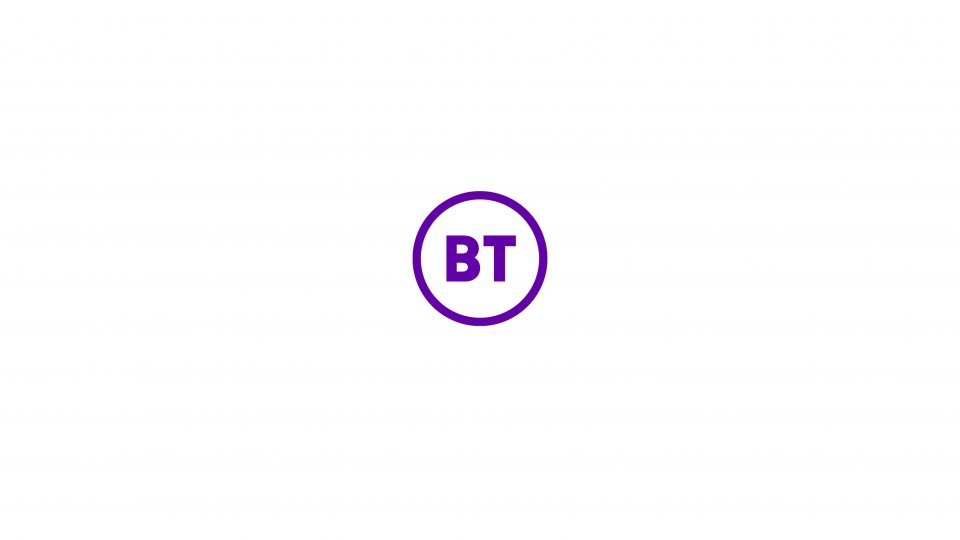
BT has spent years redesigning its logo and Twitter hates it
BT is set to unveil its new logo after years of planning, but the internet's reaction won't have delighted bosses at the telecoms giant.
Earlier this week the telecoms giant filed a trademark application with the Intellectual Property Office for a new, minimalist logo depicting the letters “BT” in a circle as new chief executive Philip Jansen kick starts an overhaul of the brand.
Read more: BT staff handed £50m in annual share payout

“We’ve shared our new logo with our colleagues today and will consult them on the detail as we gradually roll it out towards the end of the summer,” a BT spokesperson said.
“Our chief executive has been very clear that the new mark symbolises real change. Making every BT employee a shareholder in the company is the first step towards transforming BT into a national champion that exceeds our customers’ expectations.”
However, Twitter was quick to mock the design.
After BT spent years – and presumably a lot of money – thinking up the somewhat bland design, Poundland tweeted to say it had spent £1 to perform a similar tongue-in-cheek overhaul.
Hey @bt_uk we've just spent a £1 updating our logo to be just like yours. #LoveYaNewLogo https://t.co/F0Rzv66Rhr pic.twitter.com/9f5VFoabzr
— Poundland (@Poundland) May 17, 2019
Meanwhile Twitter user Alex Micu – a digital director of a comms agency – said “there really is no defending that new BT logo”.
“This is not a case of looking at art and saying “I could have made that”. You really could have made that BT logo,” he added.
There really is no defending that new BT logo. This is not a case of looking at art and saying “I could have made that”. You really could have made that BT logo
— Alex Micu (@axelk) May 17, 2019
BT originally filed a trademark application for the logo in September 2016, but the firm has not rolled it out until now. A multi-coloured version of the same design was also registered at the same time, but has since been withdrawn.
The move will be BT’s third rebrand since its privatisation in the 1980s. The iconic ‘piper’ logo was brought in in 1991, before being replaced by the current ‘connected world’ image.
But the new logo, created by London design firm Red & White, has come under fire from Twitter users, who mocked its simplistic design.
One Twitter user questioned the amount of time BT had spent on the redesign.
“3 years in development? Really?!” they asked. Sadly, apparently so.
Brand expert and Twitter user Joseph Liu added: “This rebrand MUST be a joke, right? This sort of exercise is not good for the images of ANY brand marketers out there.”
About that new rebranded #BritishTelecom logo that took years of work… https://t.co/nBGvIT1cqW#BT pic.twitter.com/M5yfJien8x
— Richard Littler (@richard_littler) May 17, 2019
The logo revamp comes as part of a wider overhaul of BT’s brand, as the company looks to make a fresh start after a turbulent few years of trading.
Read more: Five things we learned from BT’s full-year results
Yesterday boss Jansen announced plans to hand out £50m in shares to BT staff every year as part of a new payout scheme.
The ‘yourshare’ scheme, which will kick off in 2020, will amount to roughly £500 per employee per year.